

Building a good typography system makes design much easier and faster. Spend time practicing typography. It is one of the most important – if not the most important – principle in UI design.
At first glance fonts and styles do catch the attention and communicate deeply with the users. It is a major part of every application, especially in those apps that contain more text than others.
Let's dive in!
FONTS... use one, max two
By no means finding the ideal font pairings is an easy task. Finding the fonts that complement each other and sit harmoniously without battling for attention, would be a scenario in a perfect world.
Pairing is a great way to make good font combinations! But the easiest way for me is to find a perfect font pairings by using different fonts within the overarching typeface family. What I mean by that is to find a font family which is made out of many weights and styles that are specifically designed to work together; as a matter of fact, I love Roboto because it offers multiple possibilities.
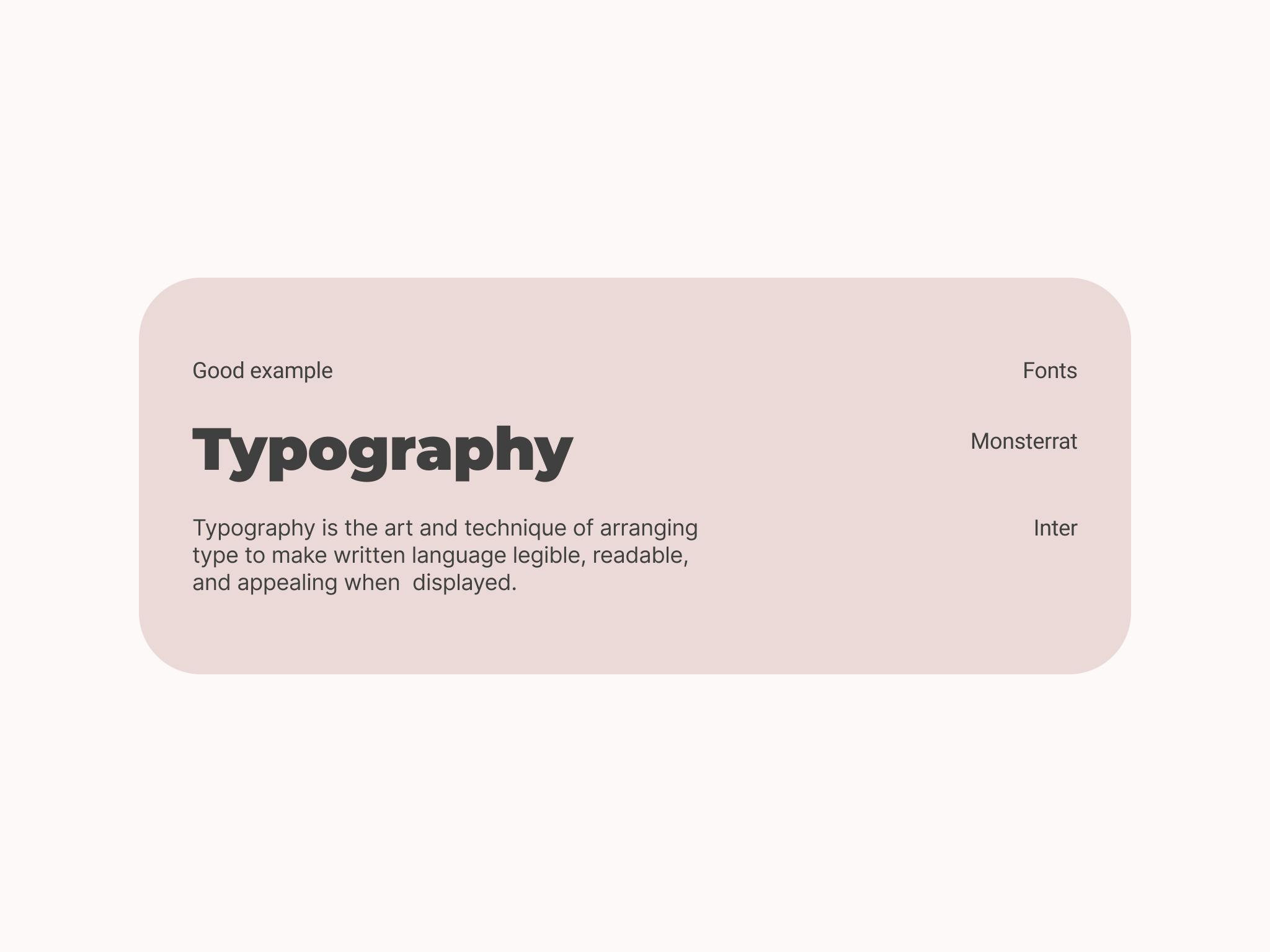
I'd like to share a few of my favorite Google Fonts:
- Roboto
- Inter
- Monsterrat
- Lato
FONT SIZE
The base font size is normally a body font – the one that will be used most frequently in the design.
Usually body font is around 16-18 pixel.
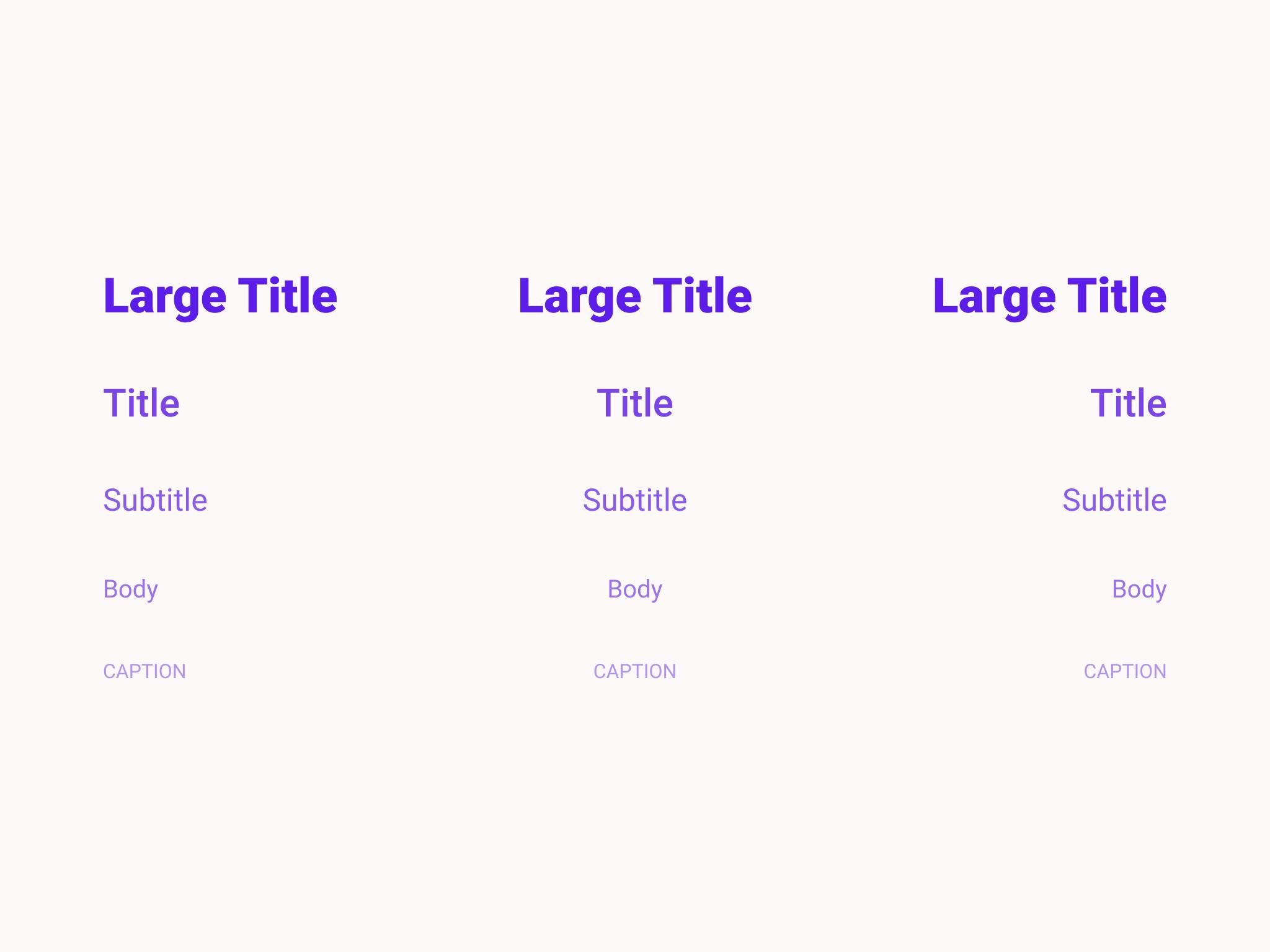
CREATE A TYPE SCALE
A simple system where you list every type size will place you far ahead and easen your life. Don't count as h1, h2...
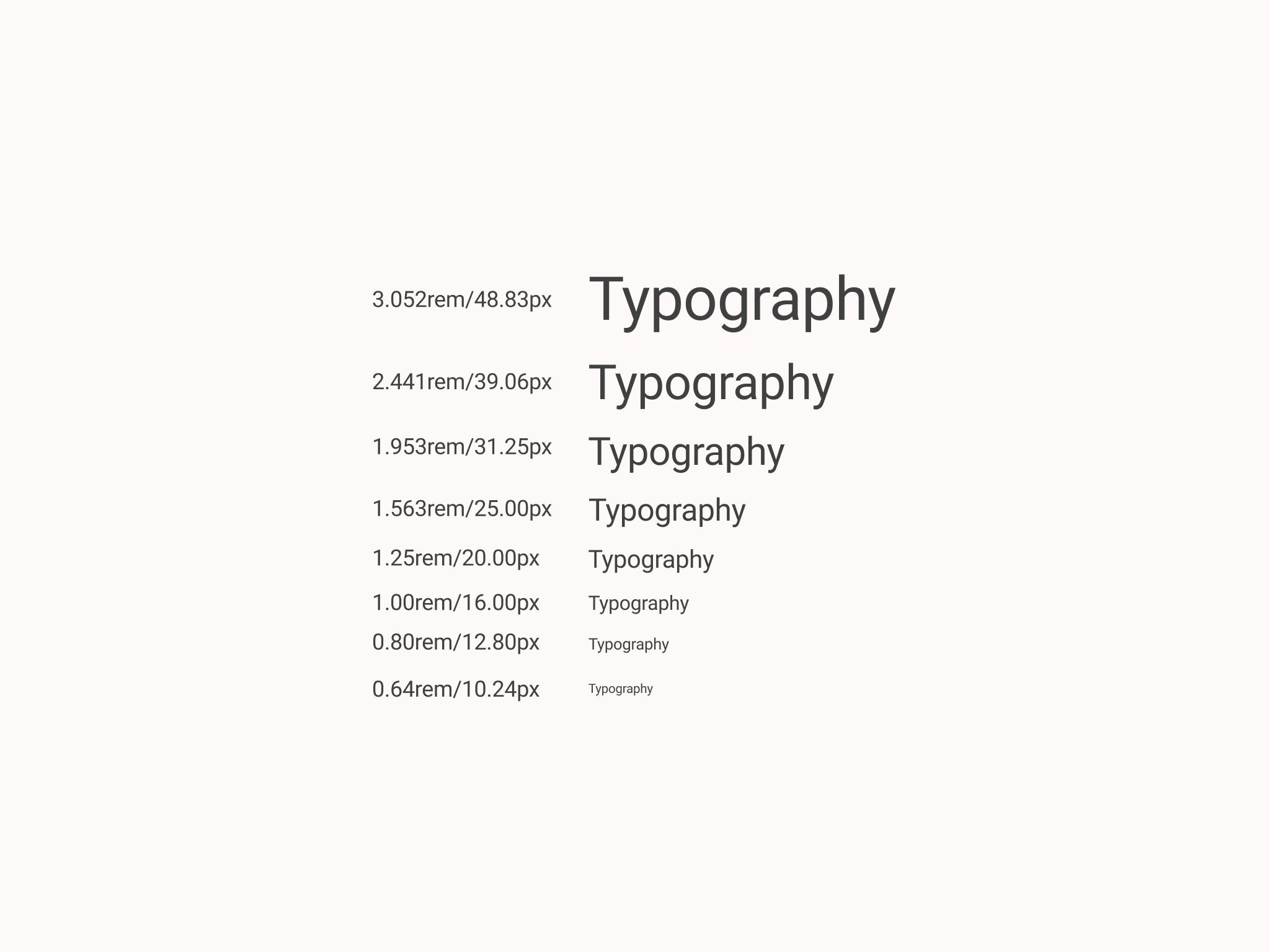
There are many methods to determine font sizes.
- By yourself
- Modular scale
You may use some helper sites like this:
LINE HEIGHT
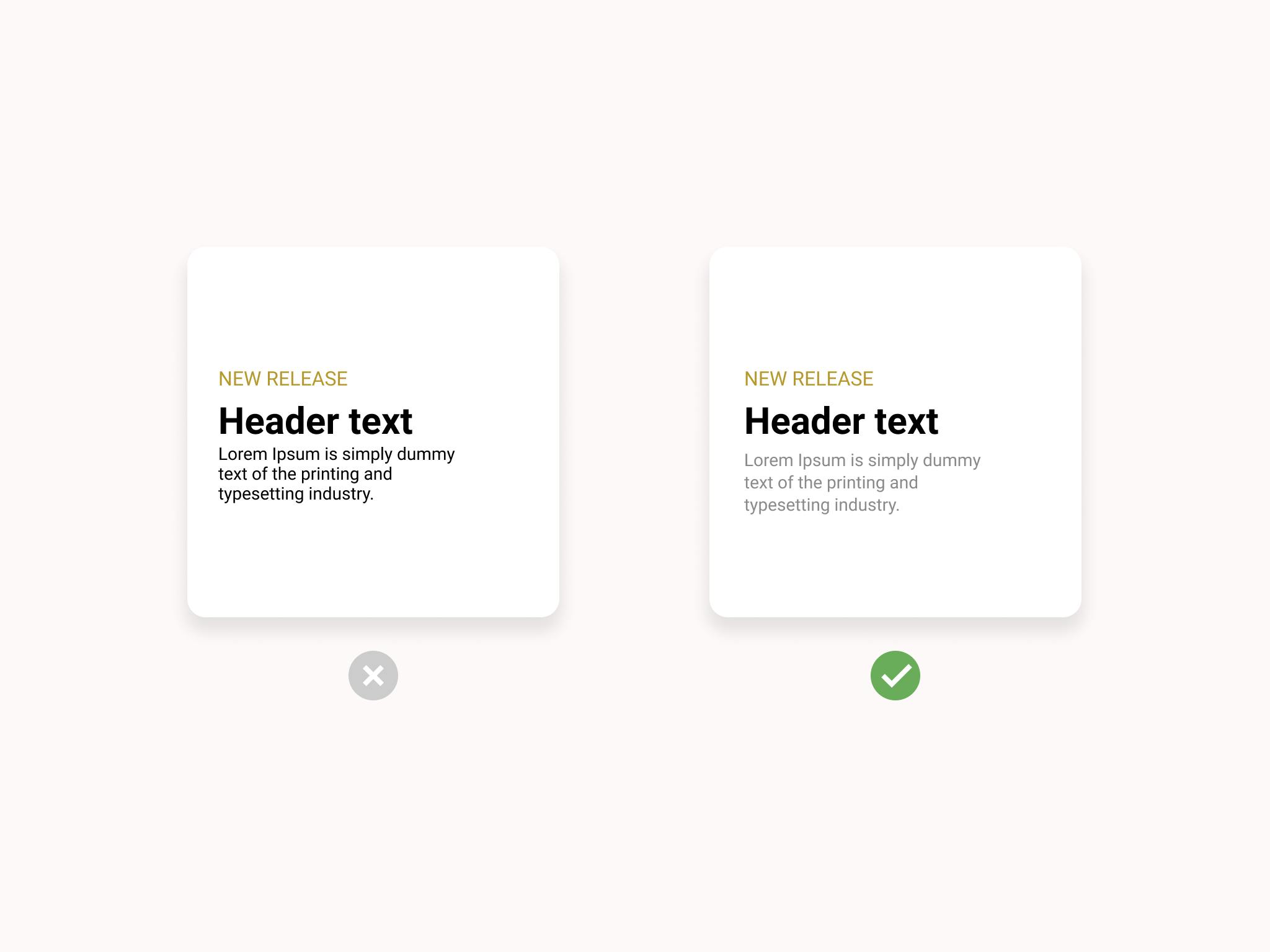
Line height is a very important design aspect for content that has multiple lines of readable text. It determines how text is spaced vertically, you'll want to make sure the distance between the lines has appropriate spacing making them clearly readable.
The height of line gets measured from the baseline of each line of text where the letters "sit". Descenders, the parts of certain letters that are longer, such as a lowercase j or p, fall below the baseline. Ascenders are the opposite, letters with taller features, such as the letter b or d. They need to be considered as well when determining the leading distance.
Traditionally, line height should range from 1.2x to 1.5x of the font size — I use x1.2 for a short paragraph and x1.5 for a long paragraph. However, individual styles may call for different distances.
ADJUST TRACKING
Tracking and kerning are often confused with each other, the concept is a some how different. With tracking, the spacing gets adjusted on the entire word. On the other side of the coin kerning is used to adjust spacing between between two letters.
Modify tracking to make text cleaner and more readable. Usually bigger fonts require less tracking, smaller ones need more space.
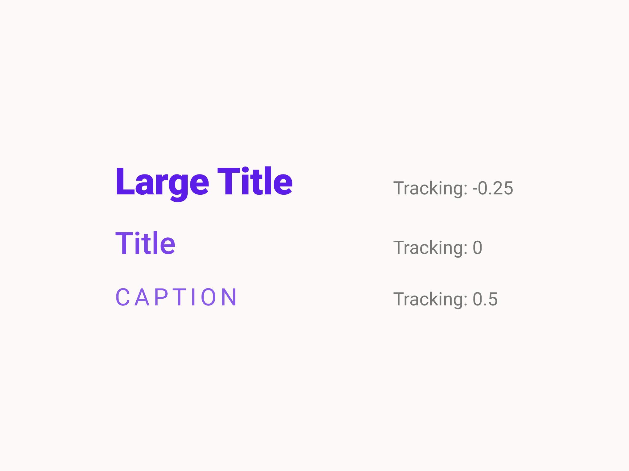
Note: Upper Case always requires bigger tracking for better readability.
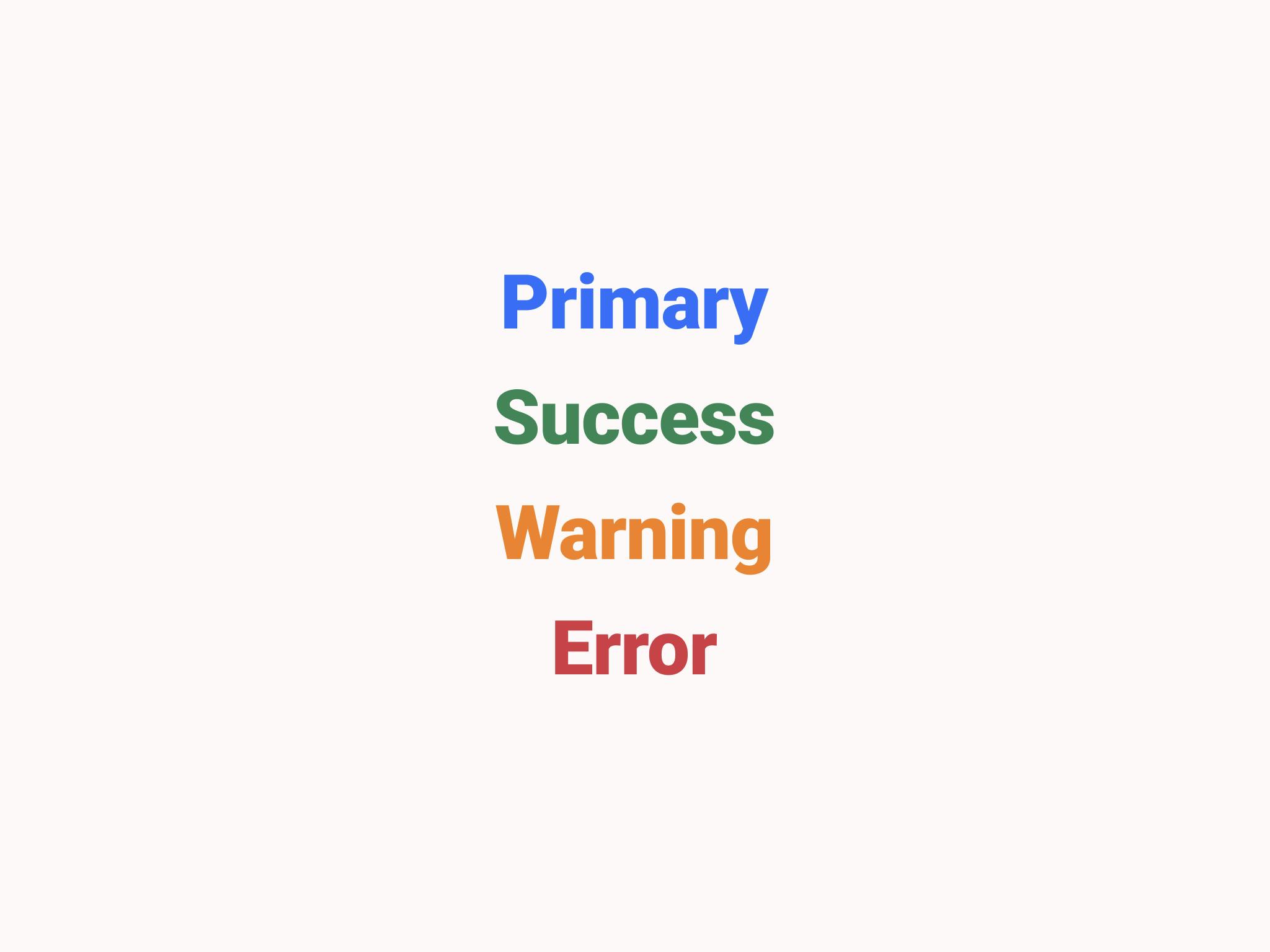
DEFINE COLORS
It is not always easy to create a color palette with so many possibilities but thanks to the available resources on the web you can find some inspiration.
Colors have meanings and the choice has to be meaningful, each color does evoke a feelings and emotions within observer. Nonetheless A color that can evoke one reaction in one person may evoke the opposite reaction in another, due to culture, prior association, or even just personal preference.
those are the platforms that I use:
My Color will create a color palette from a pre defined color given by you.
Adobe Color allows you to extract colors from any image but also lets you explore the creations of other people and it allows you to compose your own color palette.
Having the knowledge on how color effect the majority of people is an incredibly valuable competence which can lead into careers such as color consultancy or in some cases brand consultancy and many other branches of the design world.
For more information read my article about color theory.
Recap
- Pick a font family
- Set base size of a font
- Create a type scale
- Adjust line height
- Keep an eye on tracking
- Choose colors