Become a shadow master with those essential tips.
Shadows play a very important role in UI Design. In short, they elevate things — and look cool.
Why we use shadows
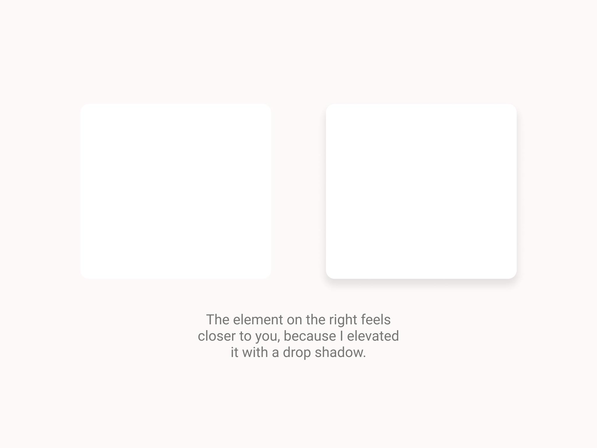
We use shadows to elevate things. Items we apply a shadow on feel closer to the user, making them stand out, and feel higher in hierachy.
Shadow hierachy
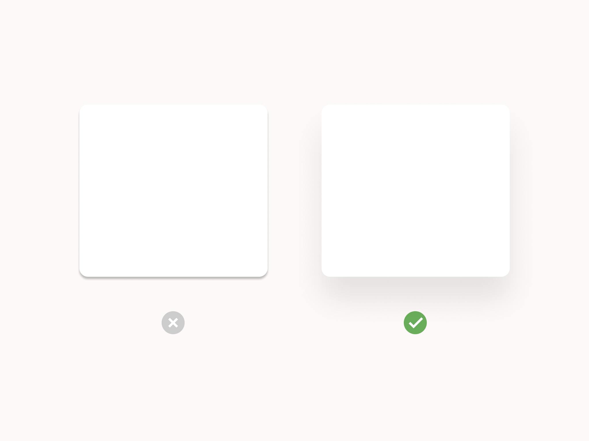
The higher the blur and Y value used on the shadow, the higher the elevation. This is why the element on the right looks like it's "higher" than the one on the left.
Use soft shadows
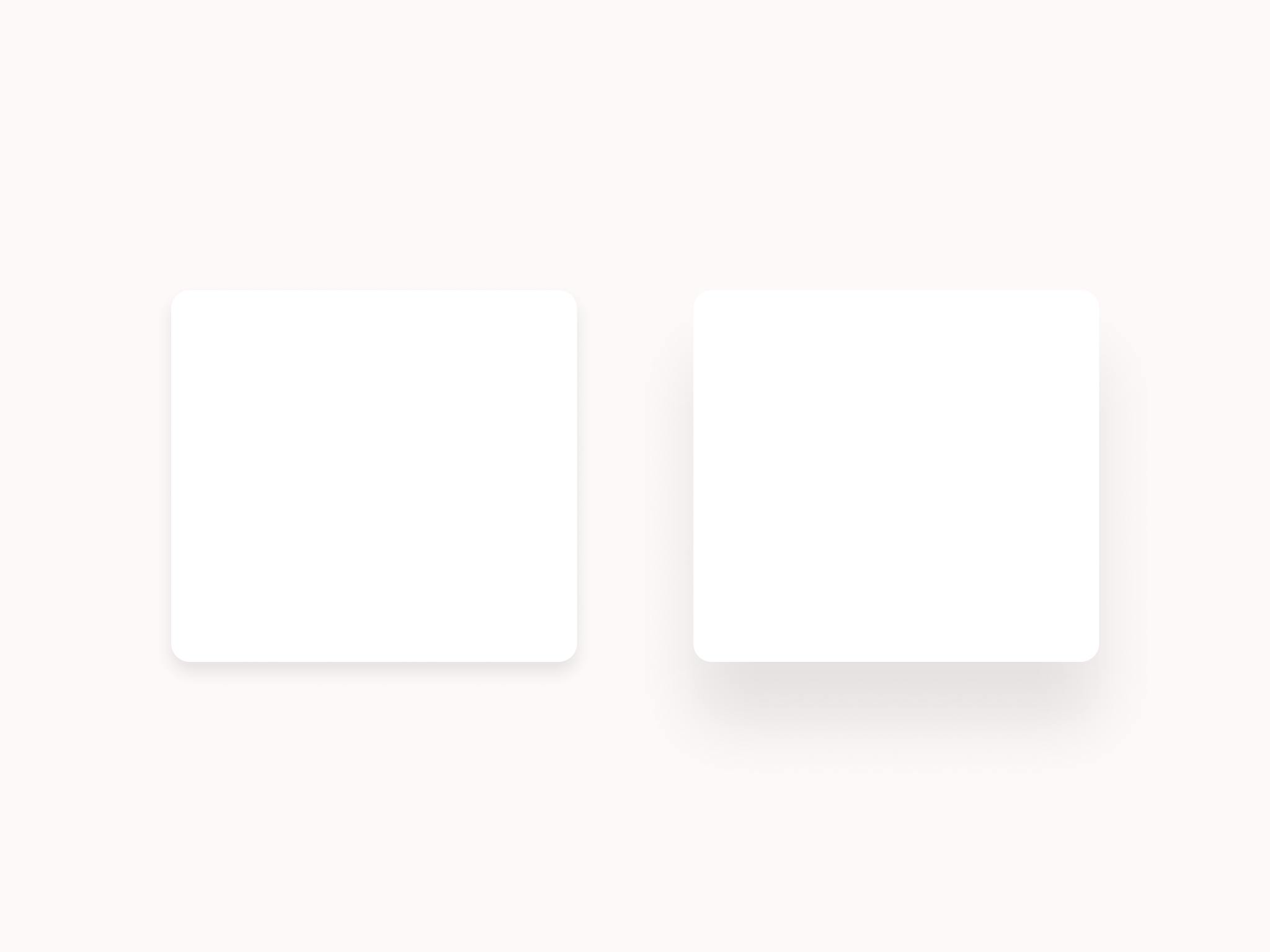
Soft shadows are shadows with low opacity (usually around 5-10%) and relatively high blur and Y values giving the design a much better feel and asthetics. Try to avoid using the default, ugly shadows.
![[soft_shadows.png]]
Avoid black shadows
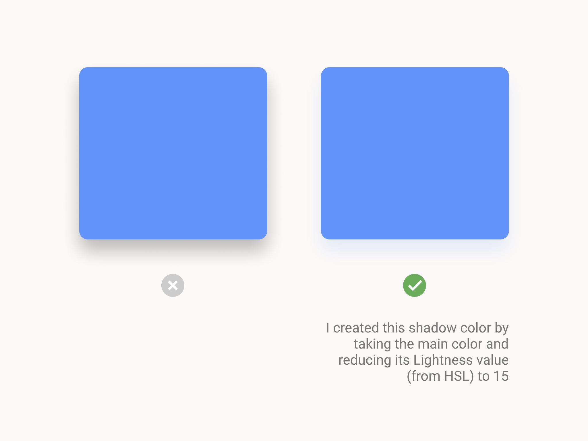
Don't use shadows made with pure black color (#000000). Instead, use a dark shade of the main color. It looks better and far more realistic.
