


To raise an average design to an awesome creation with the right colors is easy. On the flip side a color wheel has many options to pick from.
It all condenses down to a subjective perception of colors, a combination which is beautiful to me doesn't need to be appealing to you, there are guidelines, which can help to achieve a perfectly fitting color scheme for you.
COLOR PSYCHOLOGY
In the spectrum of the red color are color known as warm colors and include red, orange and yellow. These colors are known as stimulating, the emotions they induce ranges from feelings of warmth and comfort to feelings of anger and hostility.
Cold hues are on the blue side of the spectrum and include blue, green and purple. These colors are often a synonym for calmness, but nonetheless they can be used to elevate feelings of sadness or indifference.
In western culture the feeling of mystery and mourning can be invoked by the color black, but in some eastern countries it can mean rebirth. On The other side of the spectrum, the color white, could be used to showcase purity and peace, but in some cultures it can mean death or bad luck.
Moreover, the basic theory exists, which explains that colors are powerful because they have the ability to provoke specific emotions in each individual and attract people's attention. Yet there is no magical formula, a balance to the aspects and desired result can surly be found within color theory.
COLOR WHEEL
You’ve probably seen it before: the traditional wheel with 12 hues, that helps us to visualize the relationships amongst colors.
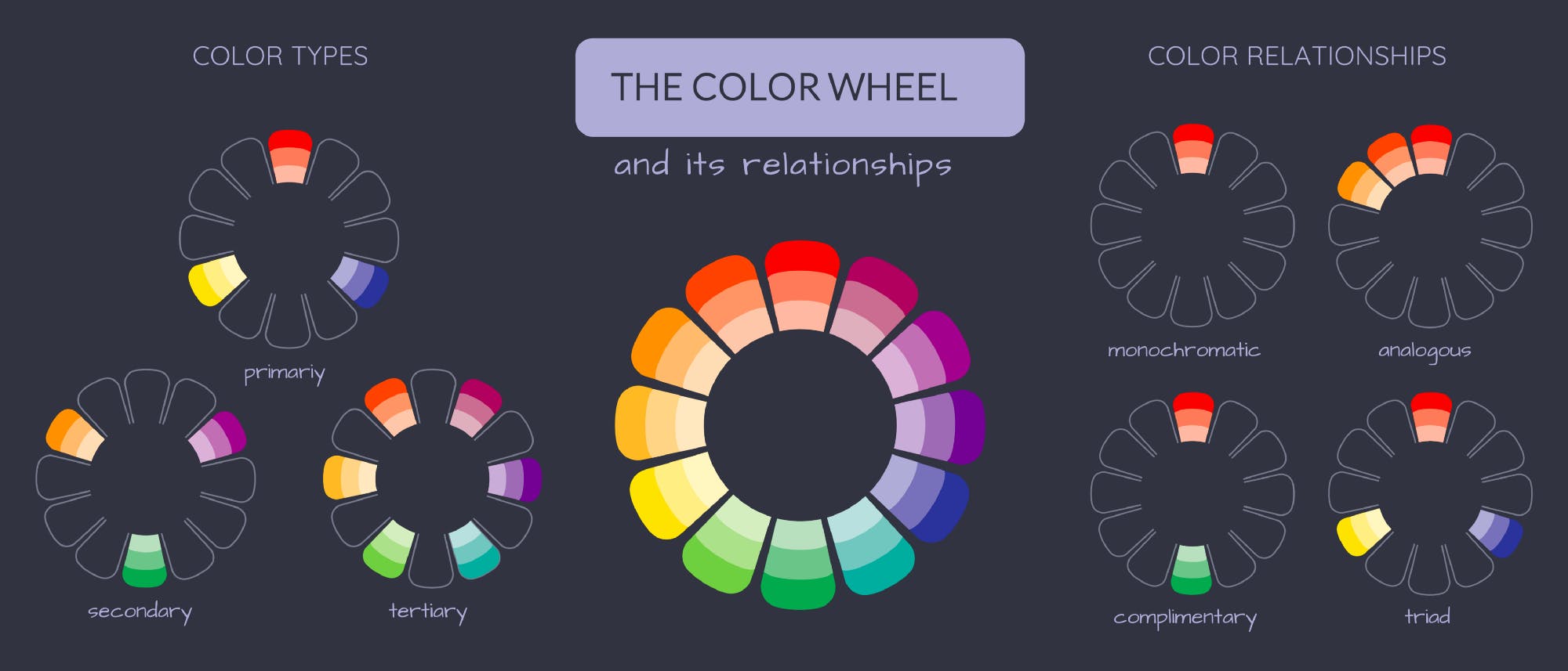
This wheel is composed of primary colors, secondary colors (the result of mixing the primary ones) and the mix of those two categories, the tertiary colors. Now, how can the color wheel help you when it comes to choosing a palette? Well, these colors are in visually pleasing relationships, that have been invented throughout the years:
Monochromatic: variations of shades, tints and tones of a single color.
Analogous: a color and the shade right next to it on the wheel.
Complementary: a color and its exact opposite on the wheel.
Triadic: three colors equally spaced on the wheel.
These are some of the relationships, that can give you a clear idea of what to do (and equally, what to avoid) when choosing your colors.
PALETTE GENERATORS
Both under and over stimulating information gets rejected by our brains, so it is very important to create a color palette that deliver both visual interest and a sense of order. One of the major areas, where designer miss out on is, a brands Design Language System (DLS), building a defined set of rules for their usage of colors.
Be effective with colors is not just about mashing whatever colors match on your work, it has a lot to do with balance. In other words: the more colors gets used, the more complicated it gets to balance them.
Ask your self these questions while checking the relationship of the colors:
- Is there enough, or too much, contrast between them?
- Is everything clear, defined and perfectly readable?
- What kind of mood does your palette evoke?
- How does one color affect other, nearby colors?
- Does the scheme fit the context?
These seemingly small but important aspects shouldn't be overlooked before finishing the work.
How your design influences people and gets perceived by the mass can be significantly affected by the choosing of your color palette. Your choice of the color palette is a huge part — it's not only an artistic aspect but also a marketing aspect.